SUMMARY
Developed an AI-powered job search mobile platform to streamline applications, enhance employer responsiveness, and address user frustration with complex and inefficient systems.
OVERVIEW
Rice University UI/UX Design Competition
Team Placement: Best Design Finalists
Duration: 48-hour competition + continued individual refinement
ROLES

UX Research
Understanding our student user base.

Product Design
Creating a product to solve a problem.
TEAM

Sarah Chang

Eric Zhou
QUESTION
How can we create a more intuitive and engaging experience for mobile job seekers?
RESEARCH

Quantitative Interviews
Survey with 32 job seekers
25% of respondents reported satisfaction levels above 6 out of 10 with existing job search platforms.
60% found current platforms to be overly complex and not user-friendly.
70% of users experienced a response rate of less than 30% from employers on job application platforms.
85% expressed a preference for a more interactive and engaging job search process, like swiping mechanisms and AI-driven recommendations.
Qualitative Interviews
Survey with 7 job seekers
5 out of 7 participants used external methods for application tracking, indicating a lack of efficient tools on platforms.
6 out of 7 participants expressed frustrations about communicating with prospective employers
TAKEAWAYS
The job search market is ripe for disruption, with widespread user dissatisfaction stemming from complex platforms, low employer responsiveness, and a clear demand for more interactive, AI-powered solutions that streamline the job application experience.
USER PERSONA
From our research I envisioned that our most ideal user would look like this:
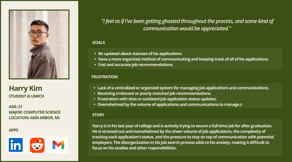
ADDRESSING THE PROBLEMS
Based on the information we gathered, we can reframe the identified problems as questions to address and design product elements that provide effective solutions.


REFLECTION
On the Other Side
The biggest step forward is trying to imagine what the app would look like on the job provider side. How would they manage thousands of applications flowing in? How would multiple employees under the same company work under the same account?
Simplifying
Currently, the app strives to do a lot and the UI seems a little overbearing to navigate in the beginning. How can I change up the app so it is much more intuitive?
Accountability + Pressure
One of the biggest selling point of the app is the faster communication for employers to update users of their progress along the application. How can the app pressure the employers to update faster, what would be their incentive?
