SUMMARY
Designed Recess to address a critical problem among college students: ineffective time management and the tendency to waste free time on unproductive activities like social media scrolling.
OVERVIEW
Rice University UI/UX Design Competition
Team Placement: 2nd Place among Beginner Teams
Duration: 48-hour competition + continued individual refinement
ROLES

UX Research
Understanding our student user base.

Product Design
Creating a product to solve a problem.
TEAM

Vicky Jen

Akshay Raj

Kristen Ok
QUESTION
How can we motivate students to prioritize productive time management over distractions like endless scrolling?
RESEARCH

Quantitative Interviews
Survey with 60 students
87% of students use some form of calendar or scheduling application, with 72% of them using Google Calendar.
71% of students identified school/work as their primary time-consuming activity.
89% of students rated their efficiency in utilizing their free time positively, with 6 or higher on a scale of 1 to 10.
Qualitative Interviews
Survey with 7 students
6 out of 7 students struggle with prioritizing and allocating time for hobbies due to perceived barriers or difficulties in initiating new activities.
5 out of 7 students express feelings of guilt or dissatisfaction about spending time on activities they deem unproductive, such as napping or excessive social media use, despite having free time available.
5 out of 7 students reported that they often fail to consistently use lifestyle and time management apps.
TAKEAWAYS
Students want to manage time better but struggle to translate awareness into action, revealing the need for a solution that transforms intention into meaningful engagement.
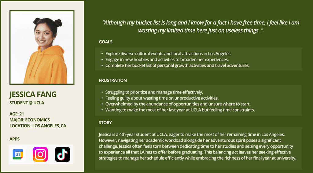
USER PERSONA
From our research I envisioned that our most ideal user would look like this:
ADDRESSING THE PROBLEMS
Based on the information we gathered, we can reframe the identified problems as questions to address and design product elements that provide effective solutions.


DESIGN CHOICES
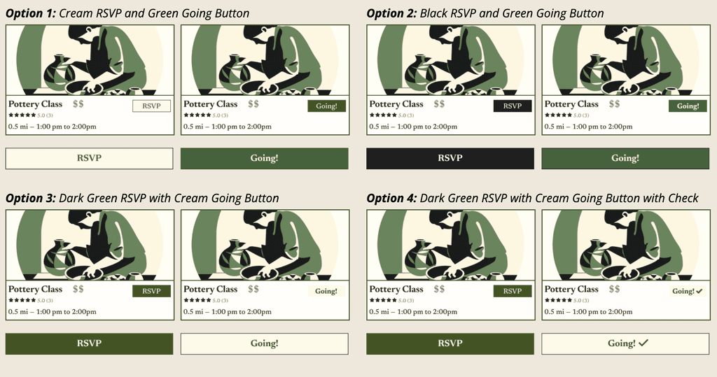
Button Color Strategy
Promoting behavior through color
I carefully evaluated four button color options to optimize user interaction and visual feedback. After testing, Option 4 emerged as the most effective design: a dark green RSVP button that transforms to a cream button with a check mark, clearly signaling action completion and providing an intuitive visual cue for user engagement.
Key considerations:
Prioritized clear action indication
Avoided color hierarchy conflicts
Created a seamless user journey through color and symbol design
Final choice highlighted the importance of subtle design elements in guiding user behavior and enhancing app usability.
Branding Image
Guiding User Attention Through Strategic Layout
First Iteration:
Recess originally featured a red, black, and white color scheme with extreme rounding, creating a commercial look. Usability testing revealed it took users 7 seconds to locate the RSVP button—too long. Accessibility checks also showed poor contrast between red and white.

Second Iteration:
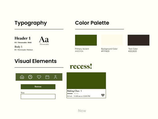
Pivotal Transformation: By shifting from a generic app store aesthetic to a vintage-inspired, peaceful design, I uncovered deeper user needs. A critical user interview revealed a preference for future event planning over immediate events, with 28 out of 31 survey respondents prioritizing forward-looking discovery.
Key Design Principles:
Prioritize user needs over design trends
Continuously validate assumptions through user feedback
Create intuitive, accessible visual experiences
Embrace iterative design as a path to meaningful solutions
Pivot and Insights:
A vintage-inspired redesign was introduced, but feedback revealed users preferred planning ahead over "now" events. A survey confirmed this, with 28 of 31 respondents favoring future event visibility, prompting a shift in design priorities.

Building Hierarchy
Guiding User Attention Through Strategic Layout
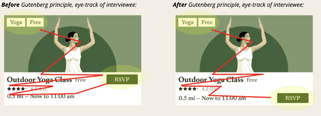
By applying the Gutenberg Principle, I transformed the app's layout to create a natural Z-shaped eye movement pattern. Relocating the RSVP button to the bottom right reduced cognitive load, streamlining information processing and decreasing user interaction time from 7 to 4.2 seconds.
Key design strategy:
Strategically place elements to follow natural eye movement
Create visual hierarchy that guides user attention
Simplify information consumption through intentional layout
The principle demonstrates how subtle design choices can significantly enhance user experience and interaction efficiency.
REFLECTION
Milestones:
With a tight 48-hour timeframe, setting milestones was essential for staying organized and tracking progress effectively.
Iterations:
Multiple iterations refined the project through user interviews and usability testing, uncovering and addressing key issues. Additional time allowed for clearer reasoning and market comparisons, reinforcing the product's value.
Next Steps:
Thus far, we’ve designed the onboarding experience for users booking plans. The next step is to create the event planner’s side of the app.
