+++남연주+++
+my links!+
TouchBase
Designed Touchbase to solve a key challenge for student job seekers: confusing application platforms and low employer responsiveness that make the process slow and discouraging.
Crafted in Los Angeles, CA · Logged 06.23.23
Prototype In Development
Team+Roles
Role: Lead Product Designer, UX Research
3 Designers
Impact
Finalists for Best Designs Overall
Timeline
Jan 2023 (2 days)
Overview
Coming back to the 2023 UI/UX Design-A-Thon with the lessons I’d learned and applying them to a brand-new challenge, I joined a new team and tackled the brief once again and was able to be selected as finalists.
Problem statement:
Mobile job seekers struggle with complex interfaces, low employer responsiveness, and a lack of meaningful engagement. This raises a key question: How can we create a more intuitive and engaging experience for mobile job seekers?
Mixed-Method Research
Key Insight
The job search market is ripe for disruption, with widespread user dissatisfaction stemming from complex platforms, low employer responsiveness, and a clear demand for more interactive, AI-powered solutions that streamline the job application experience.
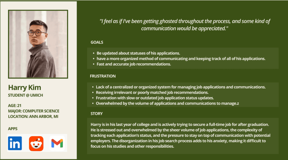
User Persona
Competitor Analysis
All major job platforms prioritize volume over user experience, resulting in cluttered mobile interfaces and high drop-off. Employer communication is inconsistent, and mobile workflows are often just desktop adaptations. None offer engaging, interactive features like swipe-based browsing or gamification, leaving student users frustrated and under-engaged.


Strengths:
Large professional network with strong credibility
AI-powered recommendations and personalized feeds
Messaging and easy profile-based applications
Weaknesses:
Cluttered mobile experience with multiple features competing for attention
Long application flows that feel desktop-centric
Low response rates and unclear recruiter communication
Indeed
Strengths:
Massive job database
Simple search and filtering
Quick Apply options
Weaknesses:
Overwhelming volume of listings
Limited mobile-friendly application flows
Minimal engagement or personalization
Tracking applications is difficult across different employers

Handshake
Strengths:
Tailored to students and early-career job seekers
Campus-specific opportunities
Some mobile-optimized features
Weaknesses:
Outdated mobile interface
Notifications can be inconsistent or unhelpful
Communication with employers is slow and often external to the app
Painpoints
Cluttered Mobile Interfaces
Job search apps feel cramped and unintuitive on small screens, making it difficult to browse roles or complete applications smoothly.
Low Employer Responsiveness
Users receive few updates or messages, leaving them checking their phones repeatedly with little feedback.
High Drop-Off and Burnout on Mobile
Long forms and dense layouts on mobile screens cause users to abandon applications or avoid searching altogether.
Design Strategies
Guiding Questions
We reframed user frustrations into design questions:
How might we reduce complexity so job searching feels manageable on mobile?
How might we improve transparency and help users track progress at a glance?
How might we encourage faster employer responses?
How might AI support decision-making instead of overwhelming it?
Concept Themes
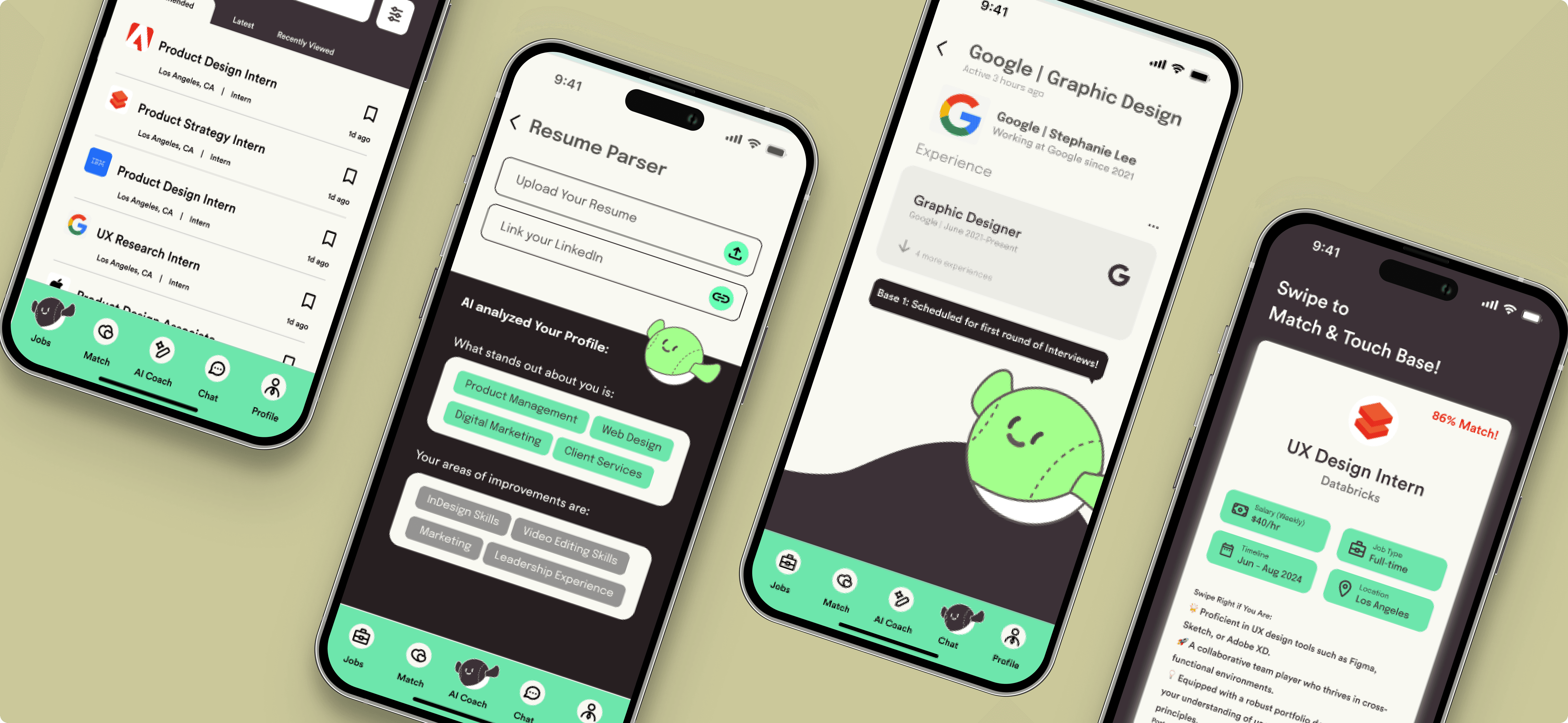
Swipe-based discovery → fun, familiar, low-pressure
AI-powered recommendations → tailored roles, less endless scrolling
Clear application progress → visual timelines and nudges
Fast communication loops → employer accountability mechanisms
Design Decisions
1. Micro-Interactions for Progress Feedback
Each application action triggers animations or confirmations to create certainty and reduce frustration.
2. Mobile-First Structure
Touch-target sizes, bottom navigation, and modular cards optimized for one-handed use.
Prototyping & Testing
Low–Mid Fidelity

Usability Testing (n=6)
Goals: evaluate clarity, intuitiveness, and task completion time
Overall: Intuitive and engaging.
✅ Users loved the swipe interaction
✅ AI recommendations felt reassuring, not intrusive
✅ Tracking dashboard reduced anxiety about application statuses
⚠️ Some early flows felt crowded
⚠️ Needed more explicit labels and status indicators
Iterations
Simplified navigation hierarchy
Increased whitespace for readability
Added clearer labeling of stages and deadlines
Strengthened communication cues between employers & applicants
Design System
Created a modular, scalable system for future extension:
Component library: buttons, cards, typography, grids.
Accessibility: contrast-checked palettes, color states, and consistent spacing for glanceable hierarchy.
Brand attributes: characters and energized colors to encourage completion.
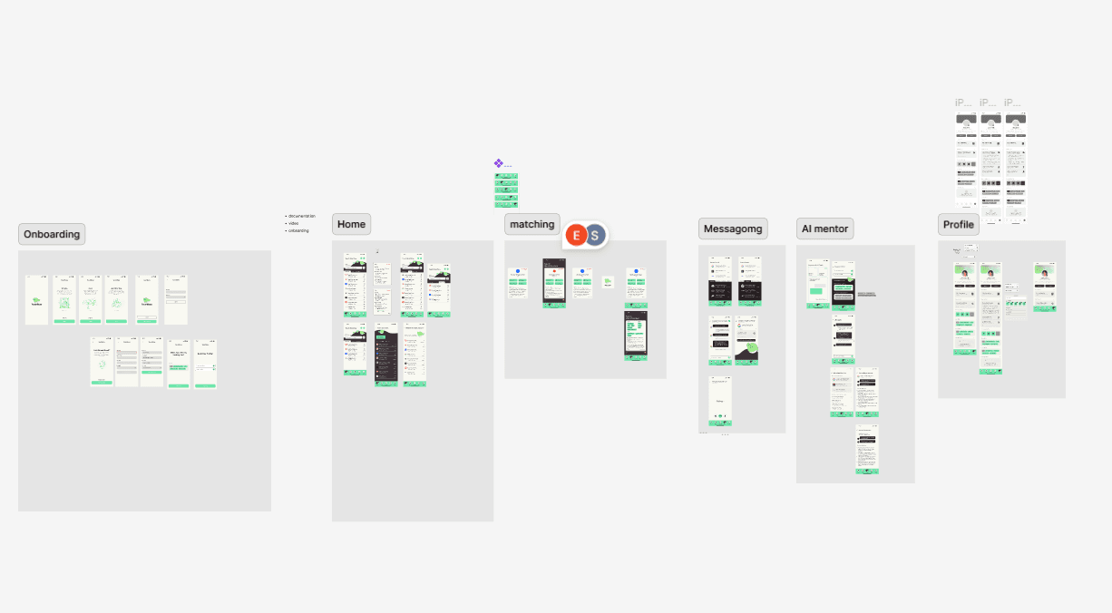
Final Prototype Flows
Reflection
Impact
Touchbase reframes job applications as a simple, guided, transparent journey, addressing the root causes of student frustration with existing platforms.
What I Learned
Constraints sharpen creativity: In 48 hours, focus meant more than scope.
Design = research + iteration: User feedback radically reshaped branding and hierarchy.
Behavior > interface: The real success wasn’t an elegant UI, it was creating conditions for better student behavior.
Next Steps
Develop employer-side tools for managing candidates
Design for summary notification for easy catch-up when users re-enter app
Build a functional prototype for real-world testing
Takeaways
Proactivity isn’t about pushing users, it’s about lowering the threshold to start. Touchbase showed me how small design choices can turn hesitation into momentum. When a system acknowledges frustration, it can meaningfully change behavior.
+Let’s Connect+
Resume
© YNam_2025